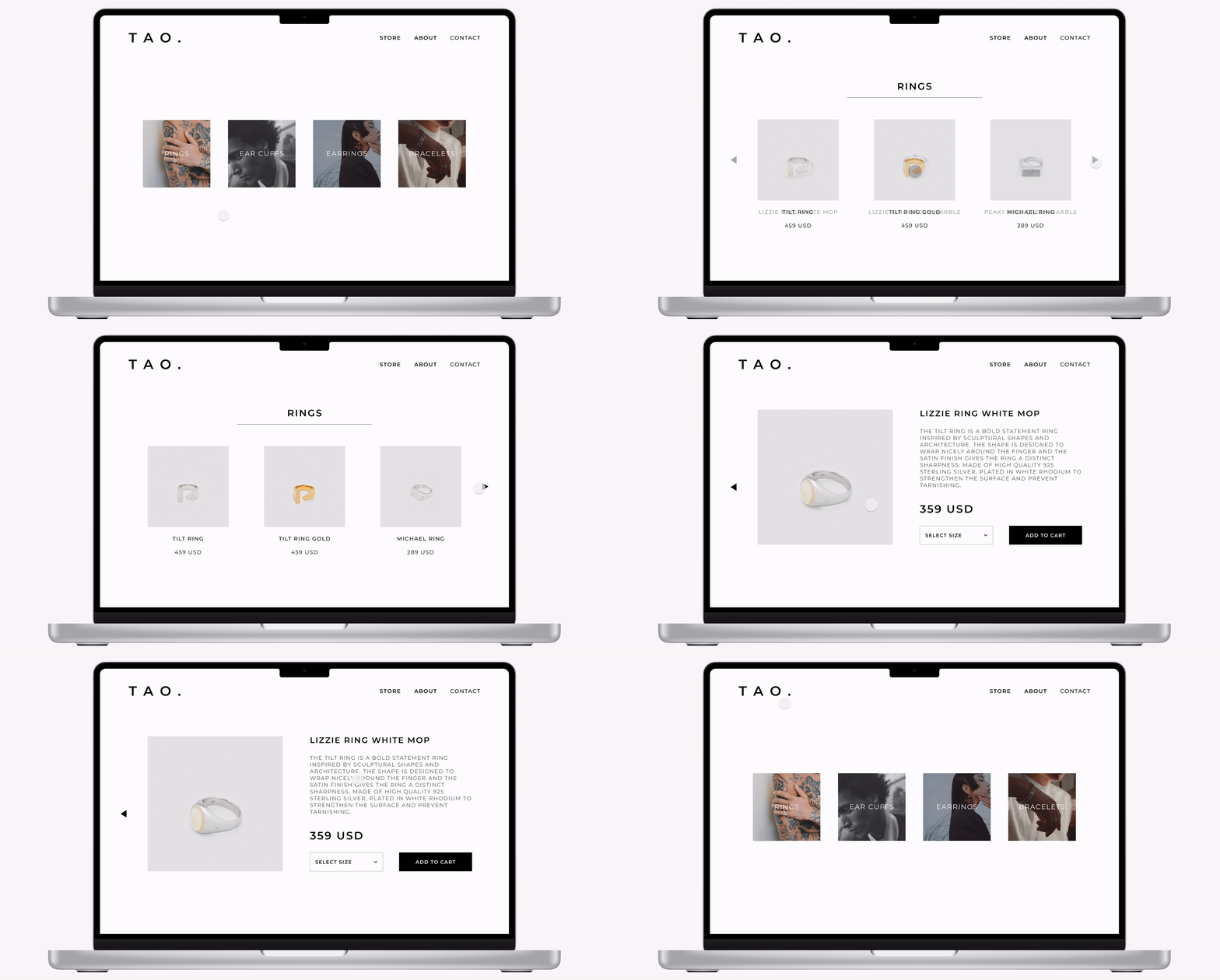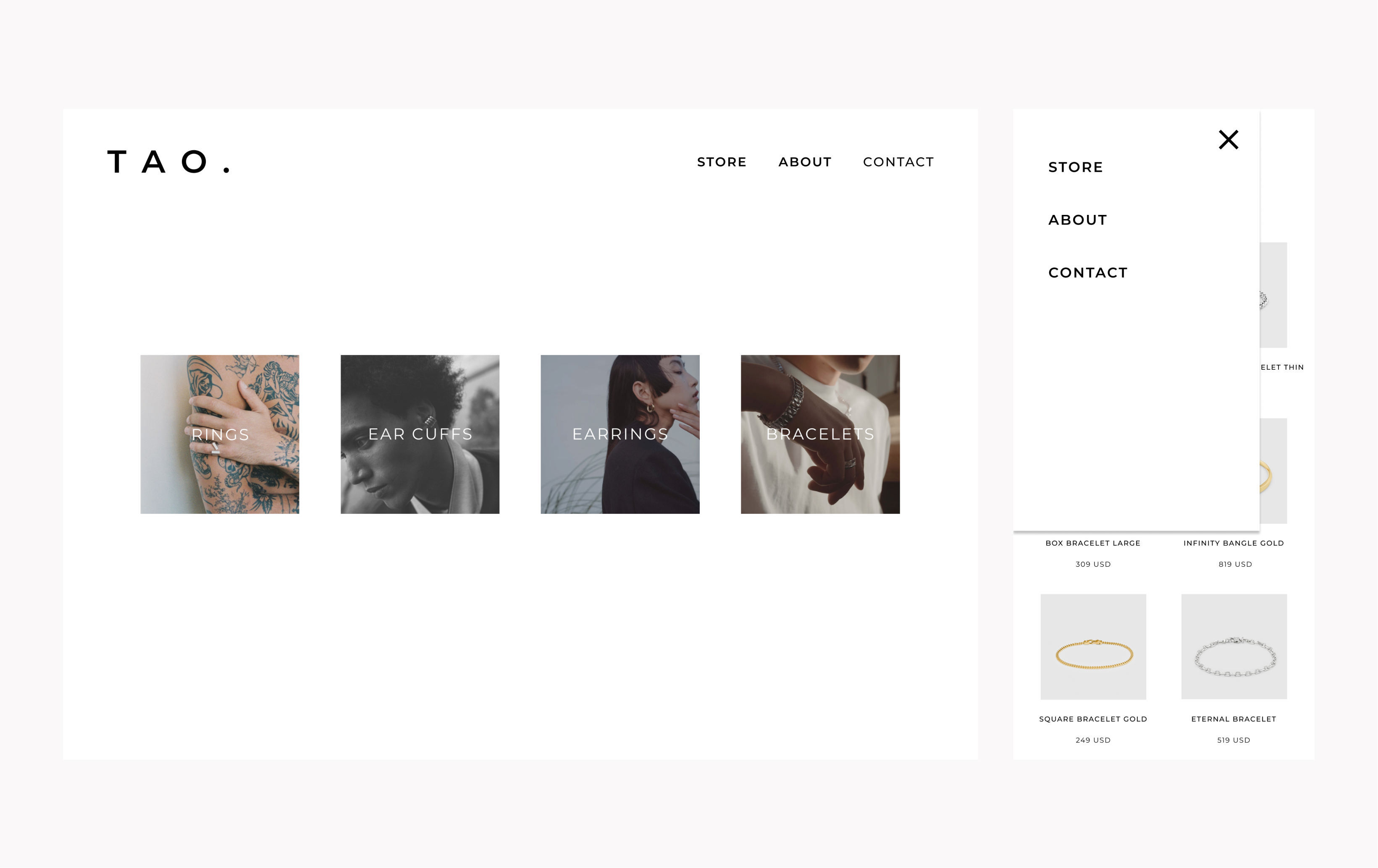
This project is a commerce experience for an accessory store.
My goal was to create a web shopping site that was modern and clean,
just like the items I wanted to showcase.
-1-
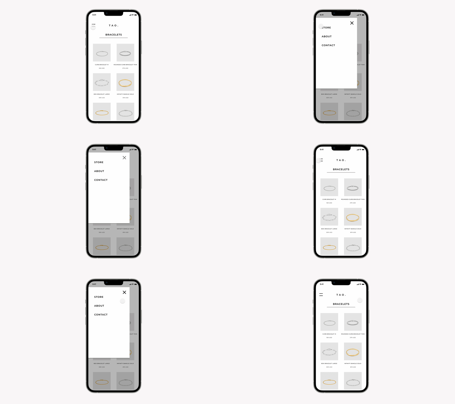
For the mobile menu, I created a slide-over layer that moves in from the top left. I wanted to make the menu feel not too small but also not have it cover the whole screen, that way it is more tap friendly when closing.
-2-
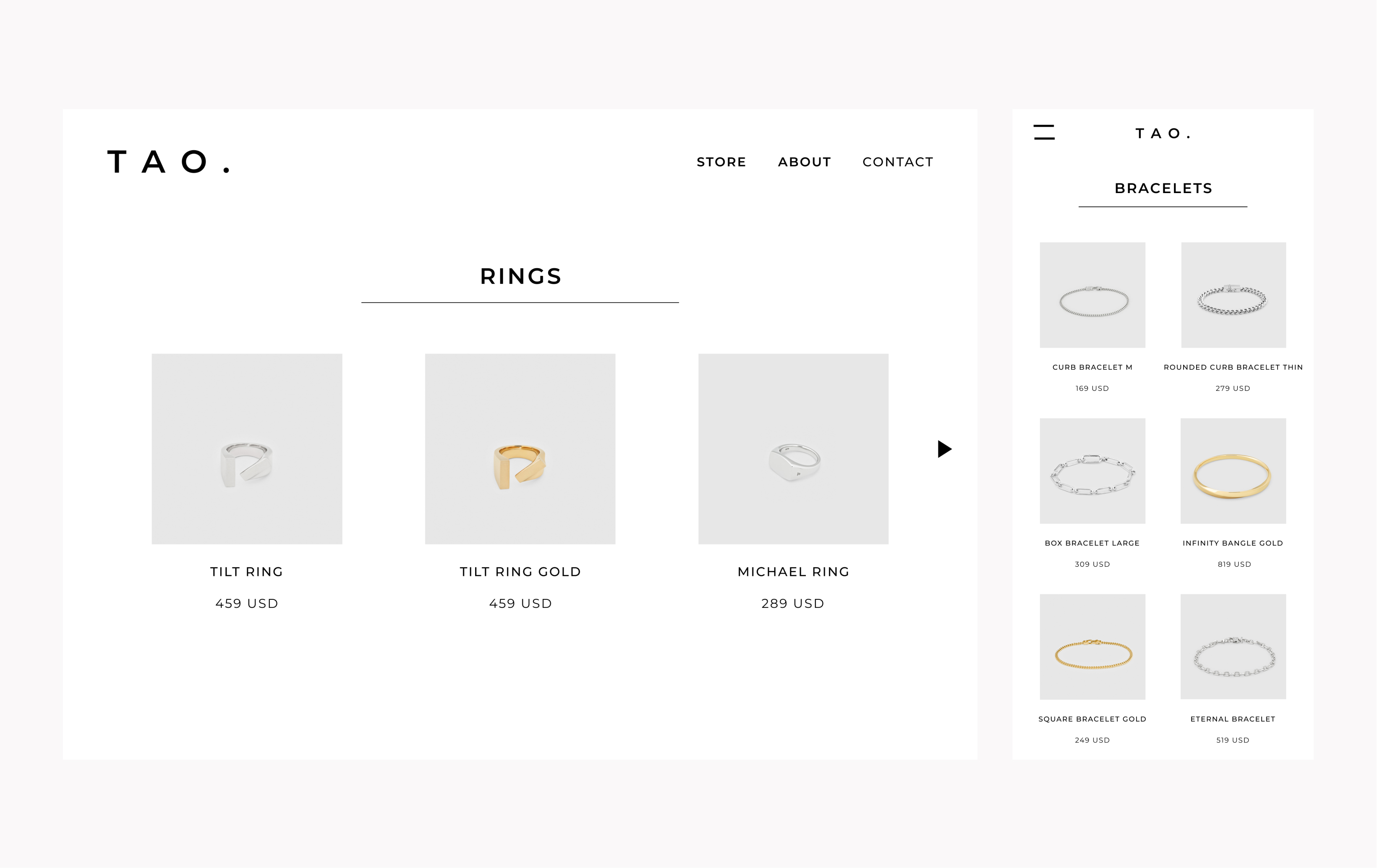
In addition to a web desktop layout, I also carefully designed an experience for the phone. Part of the challenge was using less space but still keeping the page feeling spacious and clean.
-3-
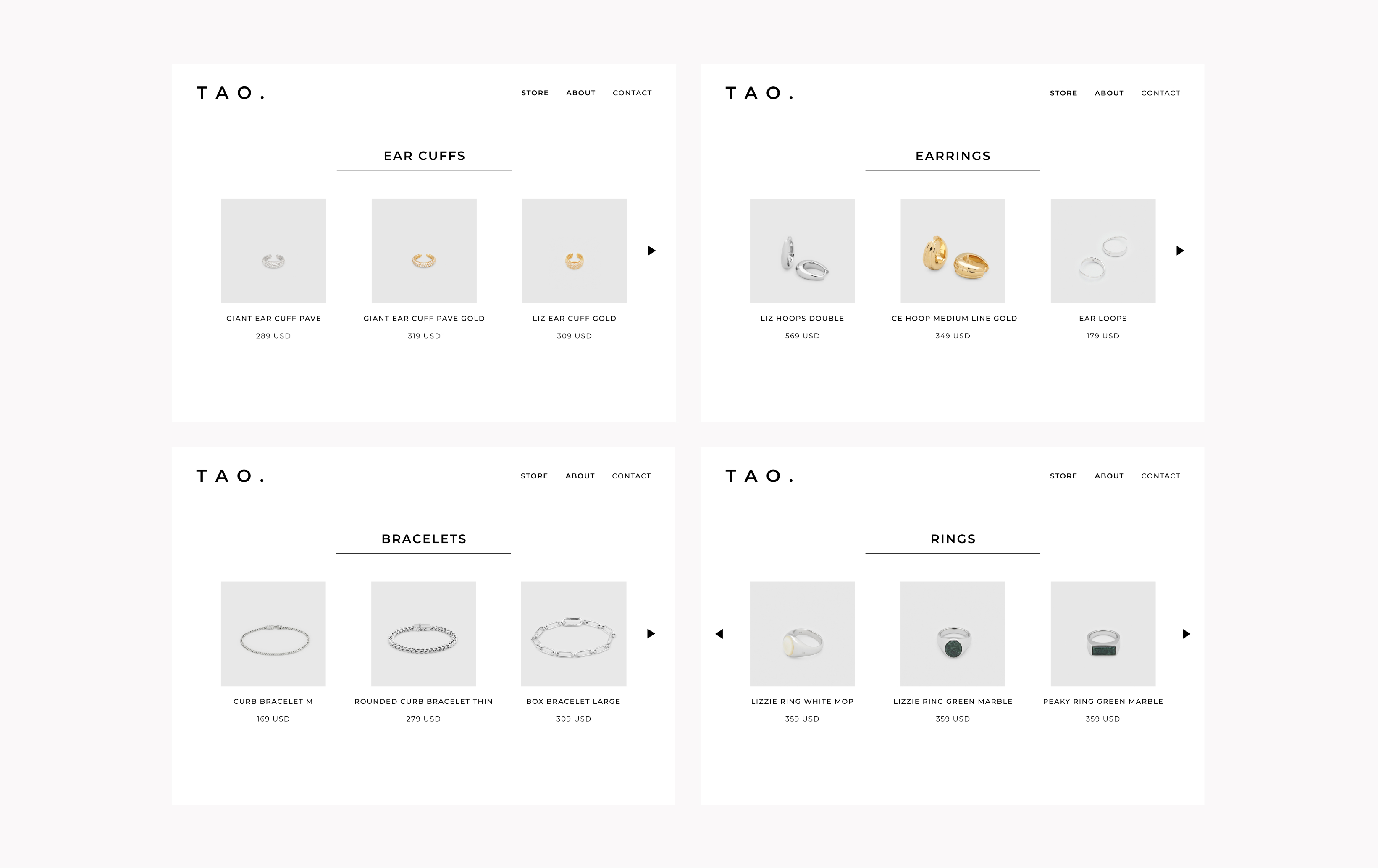
For the browsing experience, I decied to do something different. Instead of a vertically scrolling page of tiles, I created a more focused layout and interaction pattern, where you can see the items clearly and only 3 are shown at a time. This gives the jewelry a frame of luxery and emphasis.
-4-
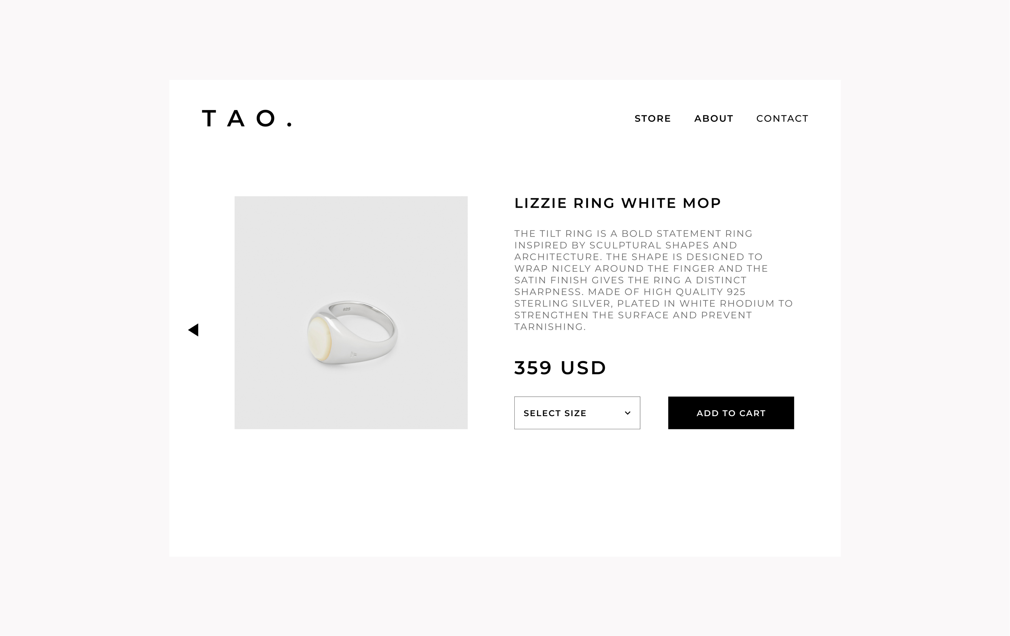
One of my goals for the item detail page is clear visual priority. The number one focus should be the item image. second is the price and cta. Third is everything else such as the item description.
-5-
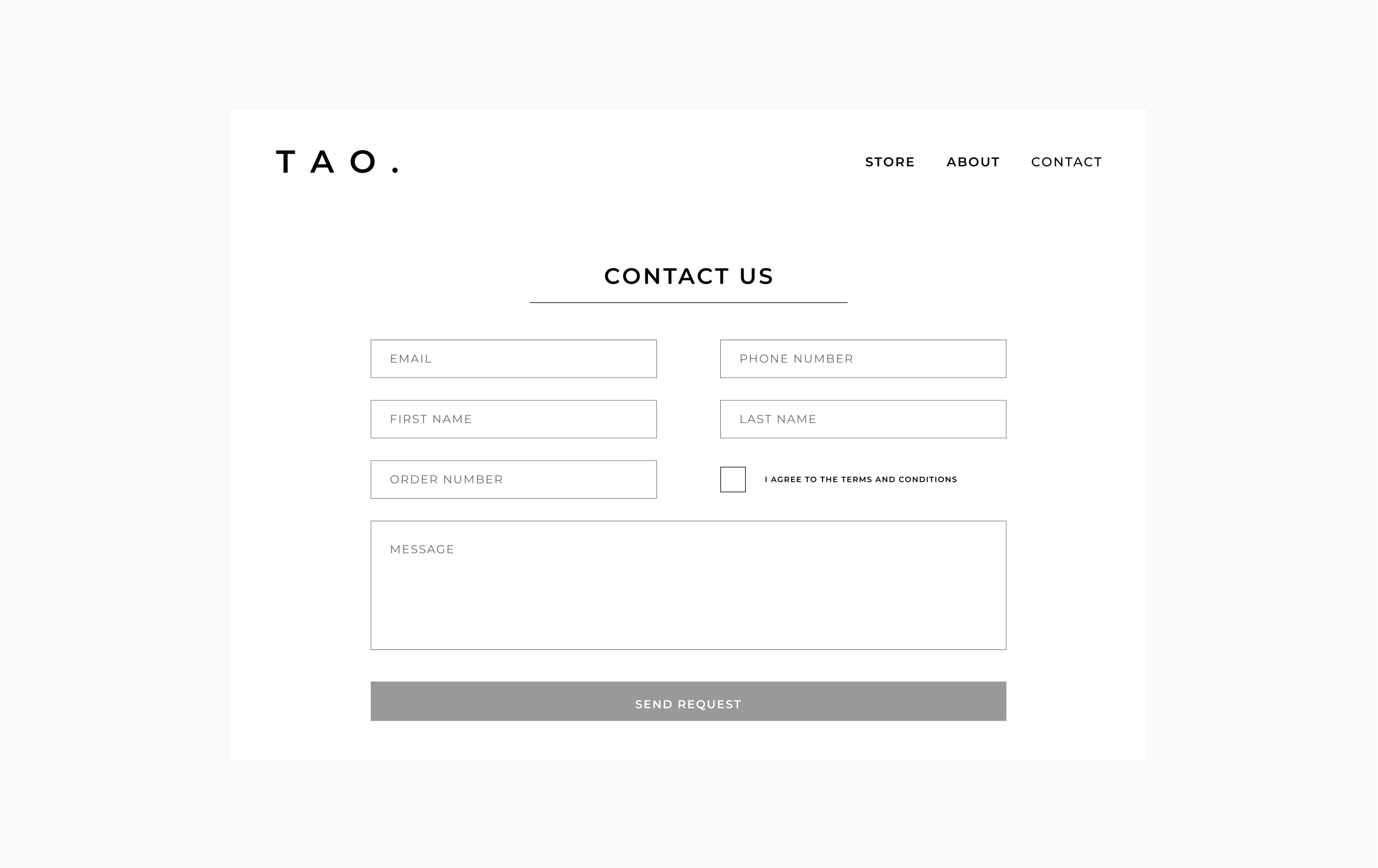
Because this is for a small boutique store, I made the contact page basic and easy for engineers to make.
-6-
